Originally published on August 23, 2022, updated January 4, 2024
Menu
Join Our Email List
- Receive our monthly newsletter.
- Stay up to date on Amazon policies.
- Get tips to grow your business.
In this guest article, Omar Deryan, Co-Founder and CEO of OJ Digital Solutions, explains how to create a more compelling Amazon main image that speaks to your target audience and gets people to purchase.
When shoppers are looking to buy on Amazon, the first thing they look at is the item's main image.
This image is absolutely critical to your success as an Amazon seller. Outside of your product title, it is your best chance to make a great first impression and persuade potential customers to click on your product instead of someone else's.
In this article, I will share some expert tips and tricks to help you design a beautiful Amazon main image that brings in more clicks and sales.
Before we get started, we first have to discuss a few of the most important Amazon main image guidelines. Basically, the main image should answer these four questions, also called the 4Ws.
This might seem obvious, but you would be surprised by the number of Amazon main images that do not clearly show what the product is.
For example, check out the main image below. Can you guess what the product is just by looking at it?

Personally, if I hadn’t gone on to read the product title, I couldn’t have understood that it is a wet paté for cats.
Potential customers need to understand what your product is at a glance. If they need to read your product title to understand what you're selling, it puts your product at a disadvantage. It’s even worse if they are shopping on their mobile device and the screen is much smaller.
Also, if you have a bundle listing on Amazon, you need to display the bundle's contents on the main image.
Your brand name should be clearly visible on the main image. If you follow the Amazon title guidelines, you should add your brand name at the beginning of the title.
But it is not enough.
Your brand name should also be visible on your Amazon main image. If potential customers need a magnifying glass to read your brand name, it will negatively affect your click-through rate.
For example, check out the difference between these two main images below.
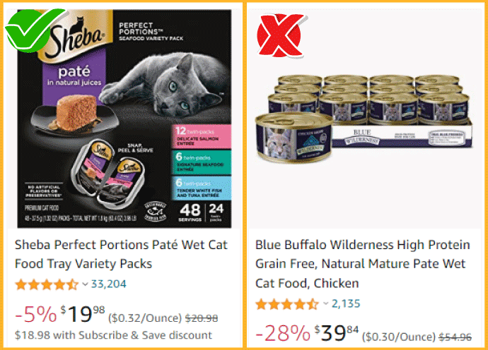
The one on the left clearly shows what the brand name is versus the one on the right, which is pretty hard to read without looking at the title.
Also, having your brand name larger and more visible helps to create brand awareness, especially for shoppers who have never heard of your brand before. If they keep seeing it while shopping on Amazon, they will remember your brand’s name and potentially buy from you.
This is crucial, especially if you're selling a product that comes in packs or sets. Or, if you're selling a product in the food and beverage category, the main image should clearly show the quantity customers will be receiving.
For example, if it's a supplement, the number of pills in the bottle.
If it’s a water bottle, how many oz or ml is it? Ideally, you would want the quantity written in a large font on your product packaging. If not, when editing the main image, you can slightly enlarge the number a bit to make it clearer.
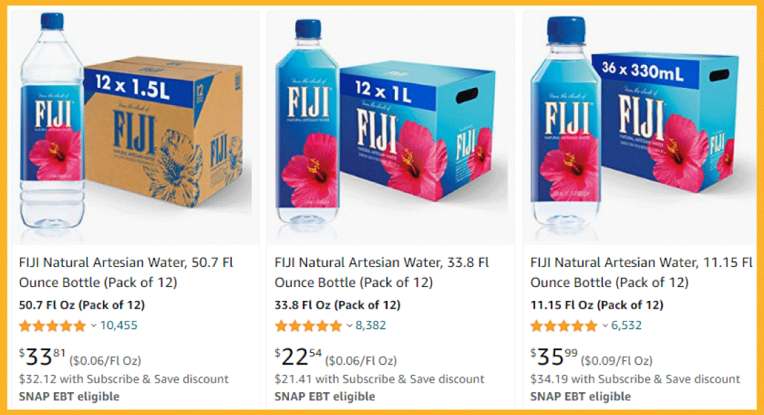
If you're selling your product in multiple variants (different colors, flavors, sizes, etc.), the main image must clearly show what variant it is.
In the example below, Fiji does a great job of clearly showing the different size/set variations on their main images.
There are many more requirements to be aware of, including strict guidelines about the Amazon main image size. Be sure to do your homework!
Now that you know what Amazon needs from the main image, it’s time to start designing your own! Here's a step-by-step guide to help you design an Amazon main image that pops.
When planning your Amazon main image, it is essential to see what your competition is doing. You can use this information to:
Basically, we're trying to model what works while also adding our own twist. To do this, simply go to Amazon and search for products in your category by typing in your product’s main keyword.
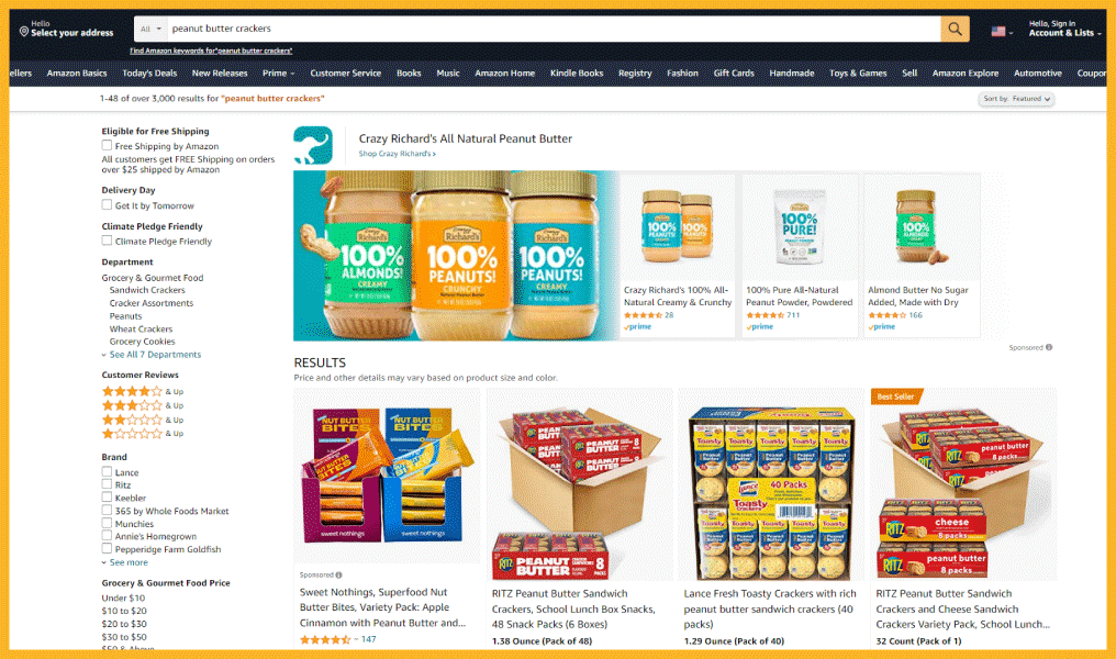
You will notice similarities in the main images of the bestsellers in your category. In the example of the peanut butter crackers, here are the bestsellers:
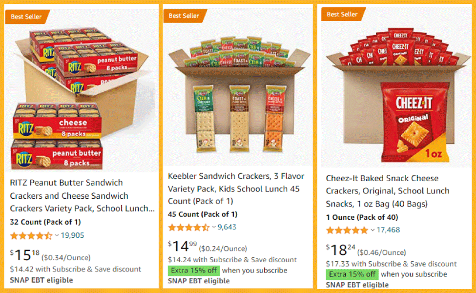
I noticed that the bestsellers in this category have these things in common:
I would definitely consider all of these elements when designing my main image.
Next, you need to find a way to differentiate yourself by creating a pattern interrupt. This is often accomplished through different design techniques like shadows and 3D rendering (more on this later).
Going back to the peanut butter cracker example, when I scrolled down the first page, I noticed that the colors are pretty similar: red, orange, brown, and yellow.
A pattern interrupt, in this case, can be using a color that has nothing to do with the rest of the competitors. This will help create an image that is both unique and effective.
Simply put, this tactic is used to attract customers to a product so they will click on it.
Amazon has many kinds of attention-grabbing elements eligible for the main image. You can either select one of them or use them in combination. Here are some of the most common:
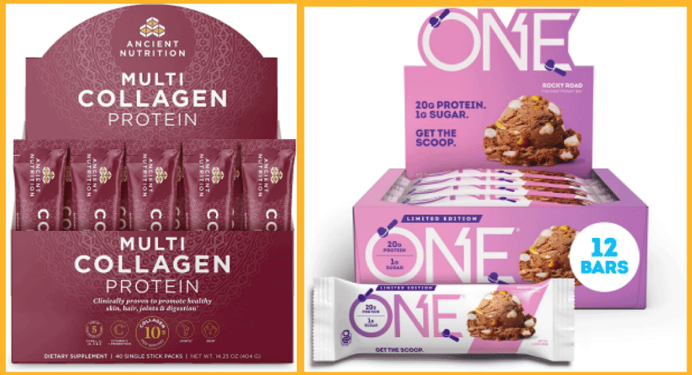
3D renders: A three-dimensional (or "stereoscopic") image of your product can make it pop and catch the customer's eye. These images are often used for products that are harder to photograph.
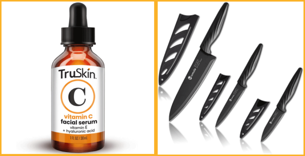
Shadow: Adding a drop shadow to your image can make it appear more three-dimensional and help it stand out from others.
Angle: You can make your product appear more unique by photographing it from an unusual angle. This can be especially effective for products that are normally photographed head-on, such as books or DVDs.
Packaging: If your product comes in an eye-catching or unusual package, be sure to include a photo of it in the main image. This can make your product more appealing and help it stand out from the crowd.
Close-up: A close-up photo of your product can help the customer see all the details and appreciate its craftsmanship.
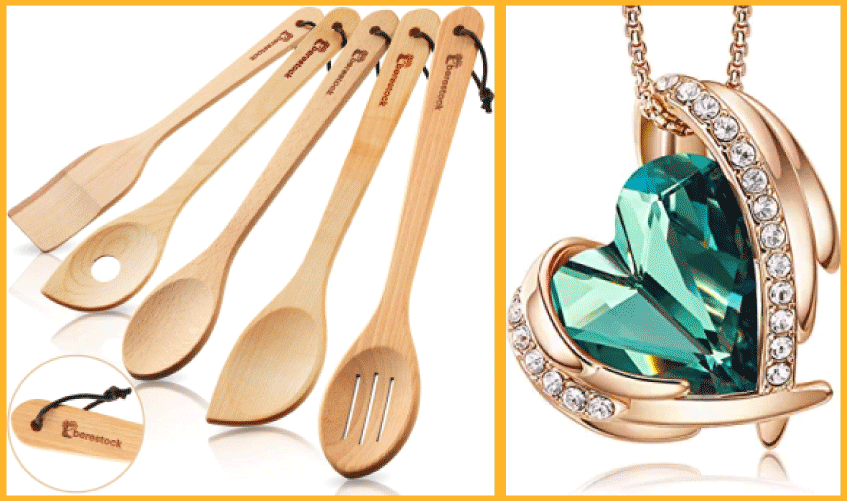
Post-edits: You can use photo editing software to add special effects to your images, such as lens flares or light leaks.
When selecting your attention-grabbing elements, bear in mind your target audience. You want to appeal to them without alienating or offending them. Keep it simple. And remember, the focus of the image should always be on the product, not the "attention-grabbing element." It should be used as an enhancement, not a distraction.
Pro tip: For dietary supplements and food products, try to display the ingredients in front of the packaging to demonstrate the product's freshness and its use of genuine ingredients.
Once you've designed your main image, it's time to test it to see how it stacks up against the competition. The best way to do this is with A/B split testing.
A/B split testing compares two versions of an image (or other pieces of content) to see which one performs better.
To do this, you must create two versions of your main image, each with a different element (such as a different background color or angle). Then you show each version to a group of people and see which one they prefer.
One of the easiest and most popular ways to do this is with the PickFu platform. With PickFu, you can create two versions of your image and show them to a group of people (called "panelists").
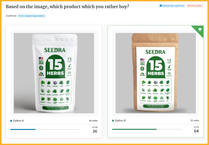
The panelists will vote on which image they prefer, and you'll be able to see the results in real-time.
The goal of the main image is to sell the click. With some additional planning and creative thinking, you can design an Amazon main image that pops and helps you stand out from the competition while still respecting Amazon's rules.
Don’t want to do it yourself? You can use an Amazon image editing service like OJ Digital Solutions to help you out! Get in touch today and we'll create something beautiful together.
Originally published on August 23, 2022, updated January 4, 2024
This post is accurate as of the date of publication. Some features and information may have changed due to product updates or Amazon policy changes.
These Stories on Amazon
14321 Winter Breeze Drive
Suite 121 Midlothian, VA 23113
Call us: 800-757-6840


Copyright© 2007-2025 eComEngine, LLC. All Rights Reserved. eComEngine®, FeedbackFive®, RestockPro®, and SellerPulse® are trademarks or registered trademarks of eComEngine, LLC. Amazon's trademark is used under license from Amazon.com, Inc. or its affiliates.
No Comments Yet
Let us know what you think