Originally published on September 6, 2022, updated September 15, 2022
Menu
Join Our Email List
- Receive our monthly newsletter.
- Stay up to date on Amazon policies.
- Get tips to grow your business.
| Review Monitoring Quickly identify review trends |
| Review Monitoring Quickly identify review trends |
In this article, eCommerce expert and Amazon vendor David T. Griffith shares an insider's look at how to build the best Amazon brand store for your business.
In a recent brand store planning meeting, it became obvious to me that eCommerce professionals still have much to learn about building and maintaining a successful Amazon brand store.
One person stated that a store can be built and function just like a traditional website. Another said it would retain the search and filtering capabilities that are standard on Amazon's search and browse pages.
Both of these thoughts are categorically untrue.
To clear up these misconceptions (and more), I created this in-depth Amazon brand store guide. You'll learn best practices for building stores on Amazon and what all the different modules mean. Enjoy!
First, determine which products in your catalog will be displayed in your Amazon brand store. Do you have any hero (seasonal or top sellers) items or new collections you want to highlight? Create a comprehensive list of ASINs you intend to use and include key attributes like titles and collection names to easily categorize them.
Next, find out which digital assets you have at your disposal. This includes lifestyle and beauty photography, branded graphics, marketing copy, and product videos. Make sure you know upfront which assets must adhere to any licensing guidelines. Use rights-owned assets whenever possible so they can remain online indefinitely.
Start this process by thinking like your customers. If you were shopping for your products, how would you want them organized? Is there a known buyer journey your customers follow on your website or in brick-and-mortar locations? Let these ideas and concepts guide you, but keep in mind that it’s okay to stray as you find more logical solutions to build your Amazon brand store.
This is where those various attributes you included in your ASIN list come into play. Plan the organizational hierarchy your store will be built upon by sorting the categories your products fall within. For example, if you sell women’s clothing, would you categorize your ASINs by dresses, bottoms, and tops? Would you break bottoms into long pants, skirts, and shorts? These are critical decisions in this early phase that will save you time and effort later on.
Take these category decisions and create a visual map of the store’s navigation. Note that the navigation menus are built on a two-tier parent-child system. The primary, or parent, tier comprises the main navigation links listed horizontally in the header of the store when viewed on a desktop.

The secondary, or child, tier links appear in the dropdowns underneath each primary link. Each primary and secondary link represents a visible page – pages cannot exist without being part of the navigation menu.
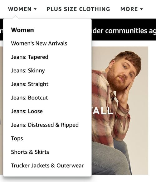 When you're populating the pages based on your categories, remember that you'll be able to use any page in your Amazon brand store as a destination for your advertising. Therefore, if you plan to run a Sponsored Brands ad targeting women’s jeans, you'll want a corresponding Women’s Jeans page to be the landing page. This type of thinking should help inform your mapping decisions.
But, let’s not forget about the home page. The front page of the brand store is the default click-through location for the brand byline found at the top of a product detail page (PDP) near the title. Use this space to introduce customers to your brand and present a high-level view of your product assortment. Highlight hero products and showcase your various categories with graphical links to the store pages.
When you're designing stores on Amazon, you really need to dig into the functionality and design restrictions of each module. Amazon store templates are available by default when creating a new page, but you also can start with a blank slate. In either case, the available modules and their capabilities do not change.
You must understand that a brand store is built on a responsive grid system. That means the content appearing on a desktop computer screen is the same that will appear on a mobile device in an optimized format. However, you do have the option of using different graphic assets for the mobile layout. Amazon's store builder enables you to switch seamlessly between desktop and mobile-simulated formats to see how the graphics work in the two different views.
There are several modules to learn about. To help you out, I've listed them below along with other essential information. Take note that not all modules can be linked to other pages. Animated GIFs are also not permitted anywhere in an Amazon brand store, but the background video tile lets you add some animation to your store pages.
Appearing across the top of the store, this image should convey your overall branding. You can use lifestyle or beauty imagery as well as other branded content. The header can be changed on different pages to reflect the section a customer is viewing. It is not clickable.
This tile displays an abbreviated version of an ASIN’s product page with a call to action (CTA) button. It will include a Prime badge, if applicable, star ratings, promotional badges, and the list price depending on the size of the tile.
Need to improve your ratings? The more buyers you reach, the better. FeedbackFive is designed to help sellers like you save time by automating feedback and review requests through Buyer-Seller Messaging or the Amazon Request a Review button.
The #1 ranked feedback and review software in the Seller Central Partner Network, now the Selling Partner Appstore, is used by thousands of sellers worldwide to customize review requests, set timing rules, get alerts for new ratings, and more.
You can only use this module once per page. It displays product thumbnails in a grid with title, pricing, star rating, and promotional badges, typically four to six products per row depending on screen settings. The grid displays up to 500 ASINs in the order you enter them. While you want to do everything possible to stay in stock, the “Hide Out of Stock Products” setting can be useful here.
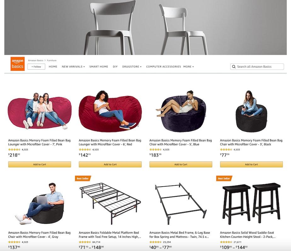
This is a new module at the time of this writing. This module features an image with an optional text header and description followed by a product grid of up to 60 ASINs. The ASINs must be contextually relevant to the image and text. More than one product collection module can appear on the same page, but it cannot share a page with the product grid module.
The featured deals module works similarly to the product grid. It features up to 500 ASINs that you must enter manually. ASINs will automatically appear and update showing badges according to current promotions you are running, like a coupon or Deal of the Day. You can only use this module once on a page.
This module is useful for showcasing imagery relevant to a specific product collection or your overall brand. It includes a title, a brief description, and a carousel displaying up to eight images. Unfortunately, none of the gallery elements are linkable.
This tile is a straightforward text block with simple formatting. It is linkable.
Another basic tile, it displays an image with an optional overlayed title. It can be linked to a product page.
This is a more advanced version of the Image tile. It includes a text block with formatting functions that can be overlayed or shown underneath the image. It is linkable.
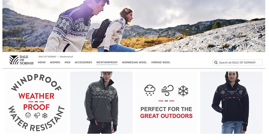
This tile enables you to place linkable hotspots over products featured in the image. The hotspots will reveal a preview of the linked ASIN and click through to the product detail page, but it cannot link to a brand store page.
This tile contains a video file you can upload in the same way you upload image assets. You must also provide a custom title image to be displayed when the video isn't playing. This is not linkable.
This tile automatically plays and loops a short video of up to 20 seconds with no sound. It’s useful for showing an animation typically created by animated GIFs on other platforms. More than one background video tile can be used on a page, but it is not linkable.
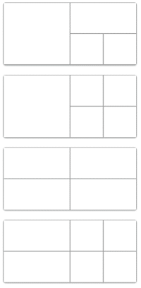 Split Section
This module’s purpose is to break an area into a grid containing smaller versions of most of the modules outlined above, which gives you some additional design and layout control. The standard split section module is set to a 2:1 ratio, meaning its width is twice its height. The cells within the various grid options are based on size ratios of 1:1 and 2:1 – important details for creating graphics to fit these layouts.
Pro tip: The product tile is not permitted in the smallest square of the split section, as it is a quarter of the page width. Clickable products at that small size are better displayed using the product grid and product collection modules.
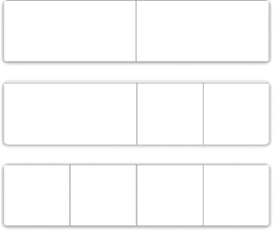 When selecting a grid layout for the split section module, you can also use the variable height option. This means you're not confined to the 2:1 size ratio I described above. However, you are limited to a grid of two, three, or four cells on one row. The cells measure a quarter or half of the full width, so a three-celled table is composed of one half-width cell and two quarter-width cells. The variable height option doesn't support video and some other tile options, but it's ideal for tall custom graphic layouts with links.
Here’s the fun part – the build! Now that you have a plan laid out and creative assets gathered, it’s time to create your pages and get them in front of customers.
The home page already exists once you create a new store. You’ll need to decide if you want your brand’s logo always present in a logo box that will remain visible on the left side of the header. If so, you’ll need to upload the graphic file based on the specs provided in the upload field.
To create a page, you click on the “Add a Page” button found at the top of the page pane located on the left side of the Stores Builder. Each new page will require a title, which is how it will appear in the navigation menu, and a short description necessary for search engines. You then select from a group of page layout templates or a blank option.
In this same page pane, you can drag and drop your pages to reorder them and create parent-child relationships. The navigation menu automatically updates to reflect the new page hierarchy.
New pages automatically take on the home page’s header graphic, or that of the parent page if created as a child page. Add modules to the page from the module pane found on the right side of the Stores Builder and begin adding content: product ASINs, graphics, video, and text. Image and video specifications are shown in the file upload areas.
Make use of the preview button located at the top-right of the screen. You can preview your build in both desktop and mobile formats. You can also send a shareable link to your team for review.
Note: All of your uploaded images and video are stored in an Asset Library associated with your Amazon Ads account.
Never be afraid of publishing a store once you feel it’s ready. You can change, remove, and update it at any time. Publishing goes through a review process on Amazon’s side, so expect your store to go live within 24 hours.
There are a few options for scheduled publication. For example, you can schedule a short-term store version to reflect a holiday or other special occasion by entering start and end dates. Once the end date is reached, the store will return to its previous version.
The second option is scheduling the start date for a store refresh. Perhaps your clothing brand has all new releases coming for the fall season, so the featured products and graphics are ready to automatically change over on August 1 and not in the middle of June when you built it.
I know this was a lot to cover on brand store building, but I can't let you go without a few key recommendations on maintenance.
Brand stores are a big yet valuable undertaking. If something doesn’t work out well, you can easily change it. Get into the habit of constantly checking (and improving) your pages based on traffic and sales. And, always remember: look at your store like a customer and maintain it accordingly. Good luck!
*All images were sourced from Amazon.com
Originally published on September 6, 2022, updated September 15, 2022
This post is accurate as of the date of publication. Some features and information may have changed due to product updates or Amazon policy changes.
These Stories on Amazon
14321 Winter Breeze Drive
Suite 121 Midlothian, VA 23113
Call us: 800-757-6840





Copyright© 2007-2025 eComEngine, LLC. All Rights Reserved. eComEngine®, FeedbackFive®, RestockPro®, and SellerPulse® are trademarks or registered trademarks of eComEngine, LLC. Amazon's trademark is used under license from Amazon.com, Inc. or its affiliates.
No Comments Yet
Let us know what you think